
Hangul Typography: Fonts, Blocks, Line Breaks, and Digital Design
The reader can notice how Hangul typography affects legibility, tone, branding, and digital reading.
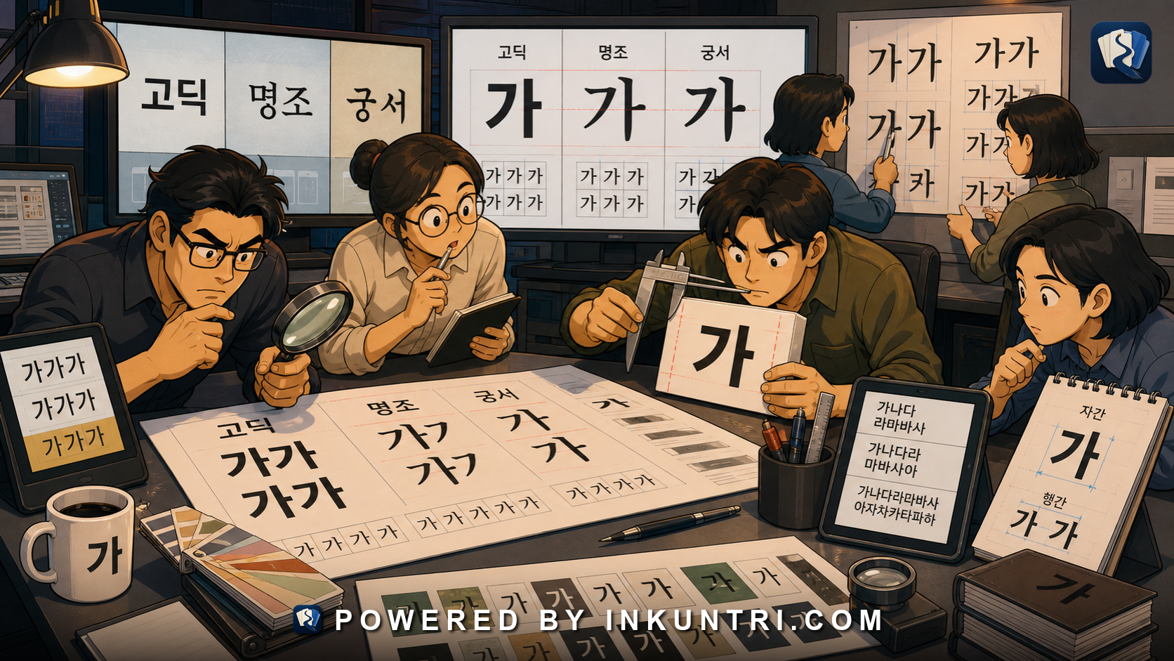
Core examples: 한글; 서울시; 메뉴; 안내문; 고딕체; 명조체; 궁서체; 굵게; 줄바꿈.
Hangul typography changes how Korean feels and reads
Learners often treat Hangul text as if all fonts are interchangeable. They are not.
A subway sign, a government notice, a cafe menu, a children’s workbook, a legal document, a cosmetics package, and a mobile app button may all use Hangul, but their typography changes readability, tone, trust, and genre.
Hangul is built from syllable blocks. That block structure creates special design concerns: density, batchim crowding, stroke thickness, line height, mixed-script balance, mobile rendering, and line breaks.
Typography is not decoration. It affects comprehension.
The square block creates density
Hangul syllables occupy compact visual blocks. Some blocks are open and simple:
- 가
- 나
- 오
- 미
Others are visually dense:
- 값
- 읽
- 앉
- 꽉
- 괜
- 끓
Blocks with final clusters, compound vowels, or tense consonants can become crowded, especially in small sizes or heavy fonts. A design that looks stylish at large display size may be hard to read on a phone screen.
This is why Korean interface design must test real words, not just sample syllables.
Font categories: 고딕, 명조, 궁서, and beyond
Common Korean font categories include:
| Category | Rough feel/use |
|---|---|
| 고딕체 | sans-serif-like; common for digital UI, signs, modern documents |
| 명조체 | serif-like; common in books, formal print, long reading |
| 궁서체 | brush/calligraphic style; formal, traditional, or decorative depending on context |
| 손글씨체 | handwriting-style fonts; casual, friendly, expressive |
| 제목용 fonts | display fonts for titles, branding, posters |
The category shapes tone. A government safety notice in a playful handwriting font would feel wrong. A children’s product in severe legal-document typography would feel strange.
Learners can use font choice as a genre clue.
Stroke weight affects legibility
Bold text can help emphasis, but too much weight can make batchim-heavy syllables blur. Thin text can look elegant, but it may disappear on low-resolution screens or signs viewed from a distance.
Compare the visual challenge in words such as:
- 안내문
- 촬영 금지
- 출입 금지
- 괜찮습니다
- 읽었습니다
The more complex the block, the more important clear internal spacing becomes.
Line height and vertical rhythm
Korean text needs adequate line height. If lines are too tight, final consonants and dense blocks may feel cramped. If lines are too loose, paragraphs become fragmented and slow to read.
This matters in:
- subtitles,
- mobile articles,
- web pages,
- textbooks,
- legal notices,
- public posters.
Korean also mixes Hangul with Latin letters, numbers, Hanja, punctuation, and symbols. Good typography keeps these elements visually balanced.
Line breaks can change parsing
Line breaks are not grammar, but they can affect reading.
A bad line break can separate closely connected elements, such as a noun and particle, a number and counter, or a verb construction. In narrow mobile layouts, Korean text may wrap awkwardly.
For example, splitting 할 수 있다 across lines can slow parsing if the layout is poor. Breaking a public sign after 관계자 외 may still be understandable, but the visual hierarchy should support the intended message.
Designers often need to balance aesthetics, screen width, and linguistic grouping.
Mixed-script typography
Modern Korean often mixes:
- Hangul,
- Arabic digits,
- Latin acronyms,
- English brand names,
- Hanja abbreviations,
- symbols,
- emoji.
Examples:
- AI 서비스
- 50% 할인
- QR코드
- 韓 브랜드
- 1+1 행사
Mixed text creates spacing and alignment problems. Latin letters may sit differently on the baseline. Numbers may look too small or too large. Hanja may have different stroke density. Emoji may disrupt line height.
A reader should learn to treat mixed-script design as normal Korean literacy, not as noise.
Subtitles and captions have special constraints
Korean subtitles must be readable quickly. They often use high-contrast fonts, controlled line length, and simplified wording. Variety-show captions may use playful typography, color, outline, and motion for effect.
This means subtitles teach not only language but also visual rhetoric. A serious caption, a joke caption, a dramatic caption, and a breaking-news caption look different.
Learners should pay attention to typography as a register cue.
Branding and emotional tone
Typography affects brand voice. A bakery menu, a hospital notice, a cosmetics label, and a city-government poster may use different Hangul fonts to signal warmth, safety, elegance, authority, or modernity.
A word such as 안내 can feel neutral in one font and ceremonial in another. 메뉴 can feel casual, premium, or childish depending on typeface and layout.
This is not separate from language. Korean readers receive genre and tone through typography as well as vocabulary.
A typography audit
Use this checklist when reading or designing Korean text:
- Font purpose: Does the font match the genre?
- Block density: Are complex syllables readable?
- Stroke weight: Does boldness help or blur?
- Line height: Is paragraph reading comfortable?
- Line breaks: Do they preserve meaningful groups?
- Mixed-script handling: Do Latin letters, numbers, Hanja, and symbols fit?
- Mobile rendering: Does the text remain readable at small size?
Mini practice: typography audit in five checks
When Korean text feels hard to read, audit the design instead of blaming only your vocabulary.
| Check | Question |
|---|---|
| Font category | Is it 고딕, 명조, 궁서, handwriting-like, or display style? |
| Batchim density | Are bottom consonants cramped in small sizes? |
| Line height | Do syllable blocks have enough vertical breathing room? |
| Line breaks | Did a break separate a particle, number, or fixed expression awkwardly? |
| Mixed script | Do Latin letters, numbers, Hanja, and Hangul align cleanly? |
This is especially useful for subtitles, app buttons, packaging, and public signs, where layout constraints can make easy Korean look harder than it is.
A strong tool for this article would let users test real Korean text across fonts and layouts.
Suggested functions:
- Font comparison: 고딕체, 명조체, 궁서체, handwriting-style, display.
- Density test: Show simple and complex syllables at multiple sizes.
- Line-break simulator: Wrap Korean text at mobile widths.
- Mixed-script view: Test AI, QR, %, Hanja, and emoji inside Korean text.
- Subtitle mode: Compare caption readability at speed.
- Genre labels: Match font choices to sign, menu, legal notice, app, poster.
Final rule
Hangul typography is part of Korean literacy.
Fonts, block density, line height, line breaks, and mixed-script rendering all affect how Korean is read. Do not treat typography as decoration after language. In real Korean, visual form carries genre, tone, authority, and usability.
Related reading
When CJK Comparison Helps Korean Learners and When It Becomes Noise
The reader can decide when Chinese/Japanese comparison accelerates Korean learning and when it creates false friends, grammar transfer, register mistakes, or institutional confusion.
Language Policy, Standardization, and Spacing Rules in Korea
The reader can understand Korean correctness debates as interactions among official norms, dictionaries, school practice, actual usage, and genre.
Sino-Korean Character Families Without Requiring Full Hanja Literacy
The reader can build Sino-Korean word families from recurring syllables without requiring full Hanja literacy.
Color Words in Korean: Tradition, Marketing, and Politics
The reader can classify Korean color words as literal description, traditional symbolism, political label, marketing style, or fixed expression.
Hanja Beneath Hangul: The Hidden Sino-Korean Layer
The reader can recognize the Sino-Korean layer behind Hangul words without needing to become a full Hanja reader on day one.
Modern Korean Through Japanese Eyes: What Cognates Reveal
The reader can use Japanese knowledge to notice Korean Sino-Korean cognates while checking Korean pronunciation, Hangul spelling, register, collocation, grammar, and institutional meaning.