
Vertical Writing, Horizontal Writing, and What Layout Changes
The reader can understand how vertical and horizontal layout affect punctuation, line breaking, emphasis, numbers, and reading experience.
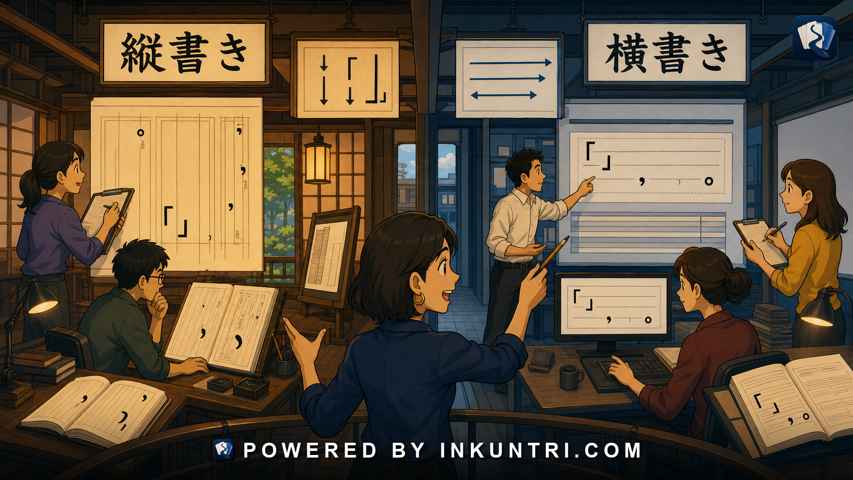
Core examples: 縦書き, 横書き, ルビ, 句読点, 三丁目, 2026年, 新聞, 小説, 漫画.
Layout is not just decoration
Japanese can be written horizontally or vertically. That fact sounds simple until you actually try to read a novel page, manga panel, newspaper column, museum sign, restaurant menu, train poster, academic PDF, or old document.
The same language behaves differently on the page depending on direction. Punctuation rotates or relocates. Ruby text changes position. Numbers may be written differently. Latin letters may sit sideways, rotate, or be set horizontally inside vertical text. Page flow changes. Speech bubbles guide the eye in different directions. A phrase that feels natural in a vertical literary layout may feel dense or old-fashioned in a mobile app.
Japanese layout is not merely a design preference. It is part of literacy.
A learner who only reads horizontal textbook Japanese may be startled by vertical writing. A learner who reads manga may understand page flow intuitively but still miss how punctuation, numbers, and quoted material are behaving. A tool builder who treats Japanese as if it were always left-to-right web text will break important reading conventions.
The better principle is:
Japanese text direction changes the reader’s path, the typography, and sometimes the writing choices themselves.
To read Japanese well, you need to read layout as part of the sentence.
The two main directions: 縦書き and 横書き
縦書き means vertical writing. Characters run from top to bottom in columns. Columns proceed from right to left across the page. This is common in novels, manga, some newspapers, formal invitations, calligraphy, traditional materials, literary magazines, and many printed books.
横書き means horizontal writing. Text runs left to right across lines, much like English. This is common in websites, apps, academic and technical writing, business documents, school handouts, forms, signs, subtitles, and most digital interfaces.
Both are modern Japanese. Vertical is not “old Japanese,” and horizontal is not “less Japanese.” They serve different genres.
A learner should associate layout with genre:
- Novels and literary prose: often vertical.
- Manga: often vertical page flow with complex panel design.
- Websites and apps: usually horizontal.
- Technical writing: usually horizontal.
- Newspapers: historically vertical in print, often horizontal or mixed online.
- Forms: often horizontal, but official printed materials may mix layouts.
- Signs and posters: can be vertical, horizontal, or graphically mixed.
The first reading habit is therefore simple: before parsing the words, determine the direction.
Reading path: where your eyes go first
In horizontal Japanese, the eye moves left to right, top to bottom. This is familiar to English readers.
In vertical Japanese, the eye moves top to bottom in each column, then proceeds from the right column to the left column. In manga, the page and panel order usually follow right-to-left flow, although individual design choices can complicate the path.
If you get the direction wrong, everything else becomes harder. Dialogue order may reverse. A sentence may appear fragmented. Punctuation will seem misplaced. A name may look separated from its title. In manga, a joke or reveal can fail because you read the panels in the wrong order.
Layout is therefore a comprehension issue, not just an aesthetic issue.
Punctuation changes its behavior on the page
Japanese punctuation marks such as 、 and 。 are placed differently in vertical writing. Quotation marks also adapt to vertical layout. The marks are not always visually identical to how they appear in horizontal text, and their position within the character grid changes.
In horizontal writing:
彼は「明日、京都へ行きます」と言った。
In vertical writing, the quote marks and punctuation are arranged to fit the vertical flow. The logical structure is the same, but the visual experience changes.
This matters because punctuation is a reading guide. If the punctuation is rotated, tucked into a corner, or positioned according to vertical conventions, the learner must still recognize its function: quotation, pause, closure, list separation, or emphasis.
The rule is:
Follow function, not just shape.
A comma still helps separate clauses. A period still closes a sentence. Quotation marks still frame speech or titles. But the layout changes where those marks live.
Ruby text: ルビ and furigana in different directions
Ruby text, or ルビ, is small reading text placed near kanji. In horizontal writing, ruby usually appears above the base characters. In vertical writing, it usually appears to the side of the base characters, often on the right side.
This is not a minor typographic detail. Furigana is central to Japanese literacy. It appears in children’s books, manga, names, difficult kanji, literary readings, educational materials, and accessibility contexts.
A learner reading vertical manga or novels must know where to look for the ruby. If the ruby supplies a standard reading, it helps pronunciation. If it supplies a nonstandard reading, it may create a literary, comic, fantasy, or character-voice effect.
Example:
宇宙(そら)
The base kanji may mean “space/universe,” while the ruby forces the reading そら, “sky.” In vertical layout, that relationship is visual and spatial. A poor digital rendering can make the relationship hard to see.
Tool builders should treat ruby as structured text, not as decorative small print.
Numbers behave differently by genre and direction
Numbers are a major layout problem.
Japanese can write numbers with Arabic numerals:
2026年 3丁目 10時30分
or kanji numerals:
二〇二六年 三丁目 十時三十分
In horizontal writing, Arabic numerals are common and visually natural. In vertical writing, numbers may be set as kanji, rotated Arabic numerals, or two-digit horizontal clusters depending on style and typography.
A vertical novel may prefer kanji numerals for literary flow. A train sign or modern poster may use Arabic numerals for clarity. An address may mix administrative kanji with Arabic digits. A newspaper may follow style rules. A manga may use whatever best fits the balloon or panel.
Examples:
- 三丁目 feels natural as a Japanese address element.
- 3丁目 is common and practical.
- 2026年 is normal in many horizontal contexts.
- 二〇二六年 may fit vertical or formal contexts better.
- 令和八年 introduces era-year conventions, especially in official contexts.
Learner habit: numbers are not merely values. Their written form tells you about genre, layout, and institution.
Latin letters and rōmaji inside Japanese layout
Modern Japanese frequently includes Latin letters: company names, model numbers, acronyms, URLs, app labels, brands, units, and technical terms.
In horizontal writing, this is simple:
AIニュース JR東日本 Tokyo 2026 URLを入力してください
In vertical writing, Latin letters create design choices. They may be rotated sideways, set upright letter by letter, grouped horizontally, or replaced with katakana or Japanese equivalents depending on context.
For example, “AI” may appear as upright letters in a vertical line, rotated as a small horizontal unit, or rewritten in katakana as エーアイ in certain contexts. “2026” may be compressed, rotated, or written as 二〇二六.
This is why vertical Japanese typography is not just “turn the text sideways.” It requires rules for mixed scripts.
Line breaking and word boundaries
Japanese does not normally use spaces between words, so line breaking is not governed by spaces in the way English line breaking is. A line can break between many characters, but not every break is equally attractive or acceptable.
In horizontal layout, web browsers and design systems must decide where Japanese can wrap. In vertical layout, the problem becomes column breaking. Punctuation should not be stranded awkwardly. Ruby should stay attached to its base text. Small kana and long marks need sensible handling. Latin text and numbers need special treatment.
For readers, line breaks affect rhythm. For tool builders, line breaks affect comprehension.
A language-learning app that displays Japanese badly—breaking ruby from kanji, wrapping small kana awkwardly, mishandling punctuation—does not merely look ugly. It teaches poor reading conditions.
Manga: layout as storytelling
Manga is one of the most layout-sensitive Japanese reading environments.
A manga page may include:
- vertical dialogue,
- horizontal sound effects,
- stylized katakana,
- handwritten-looking kana,
- ruby text,
- panel order,
- speech balloon order,
- dramatic empty space,
- punctuation as timing,
- sound effects integrated into the art.
The reader’s path is guided by panel layout and text direction. A sound effect may be more important than a spoken line. A character’s script choice may signal voice. A vertical line of text may slow the moment down. A giant katakana effect may create impact before translation.
For learners, manga is not “easy Japanese with pictures.” It is a sophisticated layout system.
Newspapers: columns, density, and scanning
Print newspapers traditionally use vertical columns. This suits kanji density and compact headline writing. A reader scans columns, headlines, bylines, captions, and photographs in a layout designed for fast information retrieval.
Online news, however, often appears horizontally on websites and apps. The same institution may therefore produce Japanese in both layout worlds.
News layout affects:
- headline compression,
- line breaks,
- caption placement,
- number formatting,
- article hierarchy,
- readability of kanji compounds,
- quotation display,
- chart and table integration.
A learner reading Japanese news should not only study vocabulary. They should also study how the page presents importance.
Novels: vertical rhythm and literary pacing
Many Japanese novels are printed vertically. The layout supports a reading rhythm associated with literary prose. Dialogue, quotation marks, paragraph indentation, ellipses, and page turns all contribute to pacing.
A sentence in a vertical novel may feel different from the same sentence in a horizontal web article. That difference is not purely sentimental. The visual rhythm changes how pauses, line endings, and paragraph breaks are experienced.
Learners who want to read Japanese literature should become comfortable with vertical layout early. Waiting until “advanced level” can make the first real book feel harder than it needs to be.
Signs, menus, and posters: mixed layout in the wild
Public Japanese often mixes vertical and horizontal text in the same visual field.
A restaurant sign may have a vertical shop name, horizontal prices, katakana product labels, English branding, and small-print official details. A museum panel may use vertical title text and horizontal explanatory text. A shrine sign may preserve traditional vertical layout while tourist information appears horizontally in Japanese and English.
This mixed reality teaches a practical rule:
Japanese layout is chosen by communicative function.
A title may be vertical because it feels elegant. A price may be horizontal because numbers are clearer. A brand may use rōmaji. A warning may use large kanji. A subtitle may use horizontal text for speed.
Reading the page means reading the design hierarchy.
Example bank walkthrough
縦書き
Vertical writing runs top to bottom, columns right to left. Common in novels, manga, traditional materials, and some print media.
Learner action: practice reading vertical text before tackling full books.
横書き
Horizontal writing runs left to right. Common in apps, websites, technical materials, and many modern documents.
Learner action: do not assume horizontal Japanese is more “beginner.” It is often the default for serious modern information.
ルビ
Ruby text provides readings or alternate interpretations. Placement changes between horizontal and vertical layouts.
Learner action: always check what ruby is doing: pronunciation, name reading, dramatic reinterpretation, or accessibility support.
句読点
Japanese punctuation must be interpreted according to layout. The marks guide rhythm and structure.
Learner action: use punctuation as a navigation system.
三丁目
Address elements may use kanji numerals or Arabic digits depending on context and layout.
Learner action: learn both forms and parse addresses by administrative unit.
2026年
Arabic numerals are common in horizontal contexts but require typographic handling in vertical text.
Learner action: notice whether numerals are rotated, grouped, or converted to kanji.
新聞
Newspapers reveal the interaction of column layout, headline compression, and kanji density.
Learner action: study layout and headline structure together.
小説
Novels often use vertical layout, affecting pacing and quotation flow.
Learner action: practice vertical reading with short fiction excerpts.
漫画
Manga combines text direction, panel order, sound effects, ruby, and expressive typography.
Learner action: read layout before translating dialogue.
A layout-aware reading routine
Before translating a Japanese page, run this checklist:
- Direction: Is the main text vertical or horizontal?
- Flow: Where does the eye go next?
- Genre: Novel, manga, sign, form, article, app, menu, poster?
- Punctuation: Where are quotes, commas, periods, and pauses?
- Ruby: Is reading text present? Where is it attached?
- Numbers: Arabic digits, kanji numerals, era years, addresses?
- Latin text: Rotated, upright, grouped, or transliterated?
- Hierarchy: What is title, body, caption, warning, label, or decoration?
This routine prevents you from treating a designed Japanese page as a plain string of characters.
A strong visual tool for this article would render the same passage in horizontal and vertical formats.
Suggested functions:
- Direction toggle: Horizontal vs vertical rendering.
- Ruby placement: Show reading text above vs beside kanji.
- Punctuation guide: Highlight how punctuation changes placement.
- Number formatting: Compare 2026年, 二〇二六年, and 令和八年.
- Mixed-script handling: Show AI, URL, JR, and English names inside vertical text.
- Manga mode: Demonstrate panel order and speech balloon reading path.
- Line-break warnings: Show bad vs good wrapping of Japanese text.
Final rule
Japanese layout is part of Japanese literacy.
Vertical and horizontal writing do not merely point the words in different directions. They change reading path, punctuation behavior, ruby placement, number handling, mixed-script typography, and genre expectations.
When you read Japanese, read the page before the sentence. The layout is already teaching you how the text wants to be understood.
Related reading
Tracking Japanese Listening Progress With Real Audio
The reader can track Japanese listening progress using real audio, transcripts, comprehension targets, error categories, and repeated measurement.
When CJK Comparison Helps Learners and When It Becomes Noise
The reader can decide when CJK comparison accelerates Japanese learning and when it creates noise, overconfidence, or bad habits.
Japanese Shadowing With Drama, News, and Interviews
The reader can build a Japanese shadowing practice that changes depending on whether the source is drama, news, interview, or presentation.
The Real Function of Kana in Advanced Japanese
The reader can see kana as advanced grammar infrastructure, not just an introductory phonetic alphabet.
Plain Form, Polite Form, and Where Grammar Meets Social Distance
The reader can choose between plain and polite forms by considering grammar, relationship, genre, and social distance rather than politeness alone.
From Flashcards to Literacy: When Japanese Study Must Leave the Card
The reader can recognize when flashcards have stopped helping and transition toward reading, listening, domain literacy, writing, and real-context review.