
From Full-Width Forms to Web Text: The Typography of Chinese on Screens
The reader learns how Chinese typography works digitally and why spacing, width, font choice, and line breaking change reading experience.
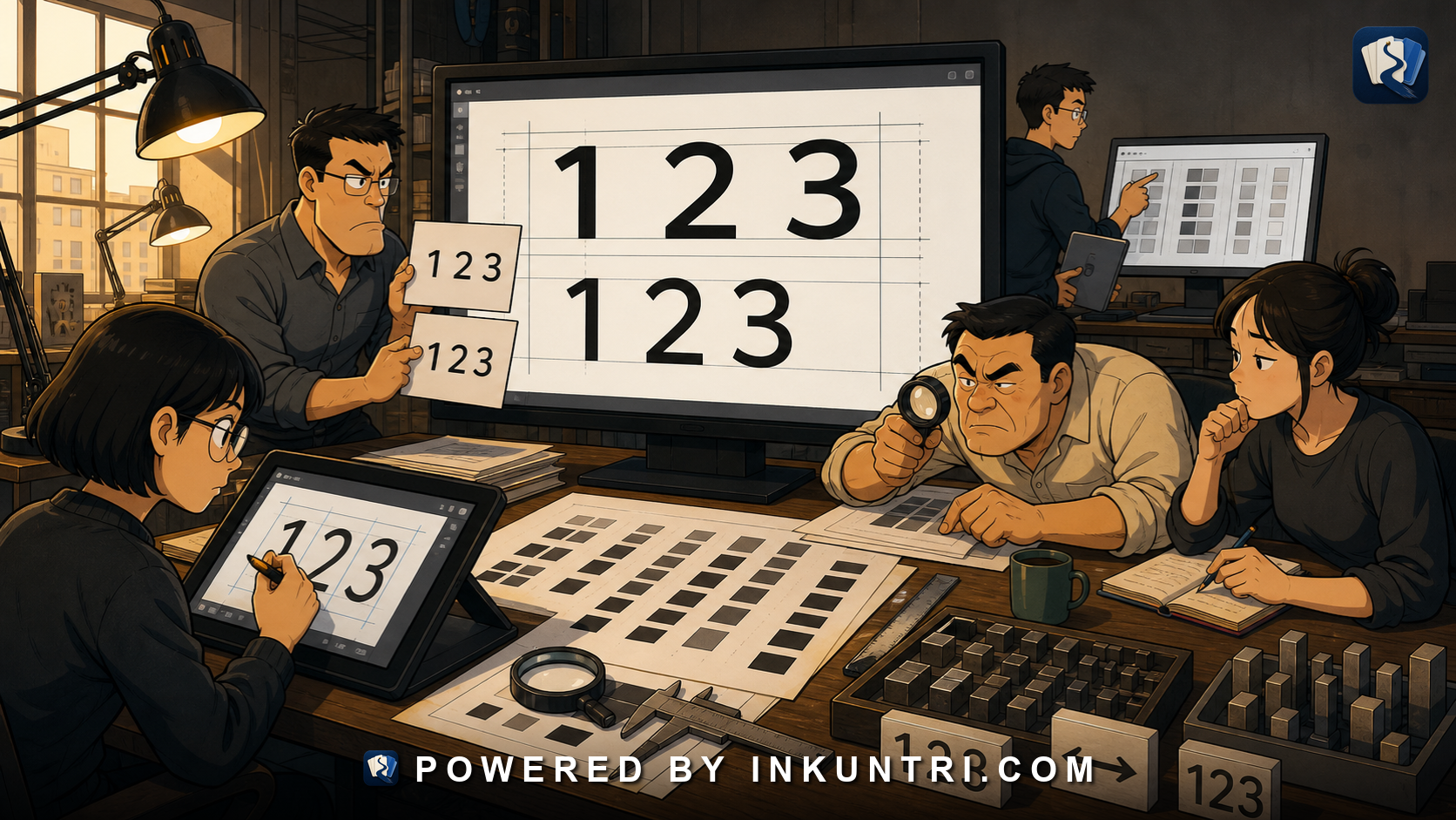
Core examples: 全角ABC, 半角ABC, 123 vs 123, 宋体, 黑体, 楷体, 仿宋, title/subtitle/UI examples.
Chinese on screens is not just characters in a font
A learner opens a Chinese web page and sees a wall of text. No spaces between words. Dense lines. Punctuation that sits differently from English punctuation. Fonts that look similar at first but feel completely different to native readers. A screenshot that cannot be copied. Subtitles that disappear too quickly. A form that rejects numbers because they were typed as 123 instead of 123.
None of this is “just design.” It is literacy.
Chinese typography affects reading speed, lookup, search, OCR, copying, translation, and even whether a learner can tell where one unit ends and another begins. The same sentence can feel easy in a clean mobile reader, exhausting in a cramped government PDF, elegant in Song/Ming style, casual in a rounded UI font, or ceremonial in a formal document style.
To read digital Chinese well, you need more than characters and grammar. You need to understand how Chinese text is shaped on screens.
The square character frame
A useful starting image is the square.
Chinese characters are traditionally designed inside a square character frame. This does not mean every visible character fills the square equally. Some characters are visually dense, some open, some narrow-looking, some broad-looking. But the underlying typographic habit is grid-like. A line of Chinese text often feels like a row of units occupying even character spaces.
This is one reason Chinese pages can look dense to alphabetic-language readers. English words create uneven shapes with spaces between them. Chinese text creates a more continuous texture. Word boundaries are not marked by blank spaces. The reader must use character knowledge, compounds, grammar, punctuation, and context.
This also explains why punctuation matters visually. Chinese punctuation often occupies a character-like space or is positioned within a character frame. A comma is not just a tiny mark squeezed after a word. It participates in the grid.
Full-width and half-width
The terms full-width and half-width are essential for digital Chinese.
In learner terms:
- Full-width characters occupy a CJK-style character space.
- Half-width characters occupy a narrower Latin-style space.
Compare:
| Type | Example | What it feels like |
|---|---|---|
| Full-width Latin letters | ABC | Latin letters forced into CJK-sized boxes |
| Half-width Latin letters | ABC | Normal Latin letters |
| Full-width digits | 123 | Digits occupying CJK-sized boxes |
| Half-width digits | 123 | Normal digits |
| Chinese comma | , | Full-width comma used in Chinese text |
| English comma | , | Half-width comma used in English text |
| Chinese full stop | 。 | Ideographic full stop |
| English period | . | Latin-script period |
The difference is not merely aesthetic. Full-width digits and half-width digits may behave differently in search, forms, passwords, databases, OCR, and programming contexts. Some systems normalize them automatically. Others do not. A learner copying 123 from a poster into a web form may discover that the form expects 123.
Full-width ASCII forms were especially useful in older computing and monospaced environments because they made mixed Chinese-Latin text align neatly. Modern typography engines can usually handle proportional fonts, spacing, and alignment more intelligently. For modern web text, full-width Latin letters and digits should usually be used deliberately, not accidentally.
Do not confuse width with script
A Chinese character is not “full-width because it is Chinese” in the same way that A is full-width. The better mental model is this:
- Han characters are designed in CJK character frames.
- Some Latin letters and digits have full-width compatibility forms.
- Chinese punctuation often uses full-width or ideographic punctuation code points.
- Modern mixed text must decide how Latin letters, Arabic numerals, punctuation, and Chinese characters sit together.
That last point is where many digital problems appear.
Consider:
请在2026年5月23日前提交PDF文件。This uses half-width digits and Latin letters inside a Chinese sentence. That is normal modern writing.
Now compare:
请在2026年5月23日前提交PDF文件。This may look visually aligned, but it is less desirable for ordinary web text. It may interfere with search and data handling. It can also look old-fashioned or system-generated.
A good reader learns to notice these forms because they often reveal where text came from: old databases, government forms, OCR output, legacy typesetting, East Asian monospace contexts, or intentional design.
Chinese punctuation on screens
Chinese punctuation has its own code points, spacing, and layout behavior. The most common examples are:
| Mark | Unicode-style description | Common use |
|---|---|---|
| 。 | ideographic full stop | sentence ending |
| , | full-width comma | internal pause |
| 、 | ideographic comma | list separator |
| : | full-width colon | explanation, quotation, list |
| ; | full-width semicolon | major internal division |
| ? | full-width question mark | question |
| ! | full-width exclamation mark | exclamation/warning |
| ( ) | full-width parentheses | parenthetical material |
| 《 》 | double angle title marks | titles |
| 「 」 | corner brackets | quotations in many traditional contexts |
When Chinese text is displayed badly, punctuation is often the first place you see the damage. A line may begin with a closing bracket. A comma may hang awkwardly. A title mark may break from the title. Mixed English punctuation may appear where Chinese punctuation is expected.
The problem is not only beauty. Bad punctuation layout can slow reading and create ambiguity.
Line breaking without spaces
English lines usually break at spaces. Chinese lines can break between characters because words are not separated by spaces. But “can break between characters” does not mean “should break anywhere.” Chinese typography has rules and conventions about where line breaks should be avoided.
For example, a closing punctuation mark should not usually appear alone at the beginning of a line:
错误感觉:
他说:“明天再来
。”
Likewise, an opening bracket or opening quotation mark should not usually be stranded at the end of a line:
错误感觉:
他说:
“
明天再来。”
Good layout engines handle many of these cases automatically, but not all websites, apps, PDFs, EPUBs, and subtitles do it well. Learners should know that awkward breaks are often typography problems, not language problems.
Punctuation compression and hanging
Chinese punctuation occupies space, but that space can be adjusted near line boundaries or when several punctuation marks appear together. This is why professional Chinese typography may look tighter and cleaner than naive browser rendering.
Consider a sentence ending with a quote:
他说:“明天再来。”The final sequence contains punctuation and quotation marks together. If every mark always occupied a full square with no adjustment, the spacing would look too loose. Chinese layout therefore uses rules for compressing punctuation spacing and handling punctuation at line ends.
A learner does not need to master these rules as a typesetter. But you should know they exist, because they explain why the same text may look different in a browser, a PDF, a printed book, a phone screenshot, and a subtitle file.
The main Chinese font categories
Chinese font names can be intimidating, but the main categories are manageable.
| Chinese name | Common English label | Rough role | What learners should notice |
|---|---|---|---|
| 宋体 / 明体 | Song / Ming | Print body text, newspapers, books, formal publishing | Serif-like contrast; feels bookish, standard, text-heavy. |
| 黑体 | Hei / Gothic | UI, signs, headings, screens, modern layouts | Sans-serif-like; strokes have more even thickness. |
| 楷体 | Kai | Education, handwriting-like display, quotations, cultural tone | Based on regular-script handwriting; can feel literary, pedagogical, or traditional. |
| 仿宋 | FangSong | Formal documents, editorial design, official-looking contexts | Slender, formal, print-derived; often seen in document-style layouts. |
These labels are not perfect equivalents to English “serif” and “sans-serif,” but the analogy helps. 宋体/明体 often plays the role that serif fonts play in long-form print. 黑体 often plays the role that sans-serif fonts play in UI and headings.
Font choice changes how text feels. A restaurant menu in 楷体 may feel traditional or handcrafted. A government notice in 仿宋 may feel formal. A mobile app in 黑体 may feel modern and neutral. A literary article in 宋体 may feel book-like.
If you only ask “Can I recognize the character?” you miss this layer. Typography tells you genre.
Song/Ming: the bookish default
宋体 in Mainland terminology and 明体 in many traditional-character contexts refer to closely related print type styles. These styles have contrast between horizontal and vertical strokes and small finishing details that make them feel somewhat “serif-like” to English readers.
They are common in books, newspapers, long-form prose, academic text, and formal printed materials. On screens, Song/Ming can feel dense if the size is too small or the rendering is poor. In high-quality layouts, it supports sustained reading well.
A learner reading a scanned book or news PDF will meet Song/Ming constantly. The challenge is not only character recognition. Dense Song/Ming text can make similar characters harder to distinguish at small sizes:
未 / 末
日 / 目
己 / 已 / 巳
人 / 入
Good typography gives these shapes enough size and spacing. Bad typography makes them collapse into visual noise.
Hei/Gothic: the screen and sign workhorse
黑体 is characterized by more even stroke thickness and relatively little decoration. It is common in interfaces, headings, signs, slides, posters, subtitles, and mobile screens.
For learners, 黑体 is often easier at small sizes because it has cleaner strokes. But it can also remove some of the stroke contrast that helps distinguish style and texture in print.
You will see 黑体 in contexts such as:
确认提交
返回首页
禁止入内
下一步
These are UI and sign-like phrases. The font reinforces function: clear, direct, quick to read.
Kai: handwriting made typographic
楷体 resembles regular-script handwriting. It is common in education, calligraphy-adjacent contexts, example sentences, invitations, cultural materials, and sometimes literary quotations.
Learners often like 楷体 because it shows stroke shapes more clearly than some print fonts. But it can be slower to read in large blocks. It also signals a different register. A whole government database in 楷体 would feel odd. A poem line or calligraphy note in 楷体 may feel natural.
Use 楷体 as a bridge to handwriting awareness, not as your only reading font.
FangSong: formal and document-like
仿宋 has a formal, print-derived feel and is often associated with official or document-style presentation. It is not simply “old-looking.” It can be used to create seriousness, institutional tone, or a printed-document atmosphere.
Learners may meet it in forms, announcements, reports, certificates, and PDF-style documents. It can look elegant, but at small screen sizes it may be harder to read than a clean Hei font.
Why spacing feels different
Chinese text does not normally insert spaces between words:
我今天下午三点去图书馆。Not:
我 今天 下午 三 点 去 图书馆。This affects reading strategies. English readers use spaces as word-boundary training wheels. Chinese readers rely on lexical familiarity and syntax.
But modern Chinese often mixes Latin letters, Arabic numerals, product names, file formats, URLs, and technical terms:
请下载PDF文件,并在App中完成注册。Should there be spaces around PDF or App? In high-end typography, spacing may be handled by layout rules rather than typed spaces. On the web, people vary. You may see:
请下载 PDF 文件,并在 App 中完成注册。This style inserts spaces around Latin-letter terms. It can improve readability in technical writing but may look inconsistent if overused. Some publishers prefer no spaces; some technology writers prefer spaces around Latin text. A learner should recognize both.
The deeper rule is not “always add spaces” or “never add spaces.” The rule is: Chinese word boundaries are not normally marked by spaces, but mixed-script text requires spacing decisions.
Mobile screens change Chinese reading
A Chinese sentence that looks fine in a print column may feel cramped on a phone. Mobile screens create several pressures:
- shorter line length
- more frequent line breaks
- smaller font sizes
- mixed Chinese, Latin letters, numbers, emoji, and punctuation
- app-specific fonts
- screenshots instead of selectable text
- subtitles or captions layered over video
For learners, mobile Chinese can be harder than textbook Chinese because the visual context is messier. A clipped notification might omit subjects. A button might use a two-character command. A screenshot might prevent dictionary lookup. A subtitle might disappear before you finish parsing.
Digital literacy means knowing when the problem is your Chinese and when the problem is the medium.
Screenshots, OCR, and copyability
A major learner frustration is the uncopyable image.
Chinese appears in screenshots, menus, posters, subtitles, scanned PDFs, social media images, app interfaces, and photos of signs. If the text is not selectable, you depend on OCR, handwriting input, or visual recognition.
Typography strongly affects OCR quality. Clean 黑体 on a plain background is easier. Stylized calligraphy, low contrast, vertical text, curved packaging, glare, compression artifacts, and old print can cause errors.
Common OCR confusions include visually similar characters:
未 / 末
土 / 士
口 / 日 / 目
己 / 已 / 巳
贝 / 见
OCR may also mishandle punctuation:
, / ,
。 / .
、 / ,
《》 / << >>
If a dictionary lookup fails after OCR, do not assume the word is rare. First check whether the OCR copied the right character and punctuation.
Subtitles as typography
Chinese subtitles are a typographic form of their own. They must be readable quickly, fit limited space, and survive background video. They often use bold or outlined Hei-style fonts, simplified wording, and tight line breaks.
Subtitles may not reflect every spoken syllable. They are edited text. But typography affects how learners use them:
- a line break can suggest a phrase boundary
- punctuation can show whether a line is a question or statement
- color may identify speakers or emphasis
- missing punctuation can make fast speech harder to parse
- stylized variety-show captions may add jokes, labels, or sound effects
A learner should read subtitles as designed reading aids, not neutral transcripts.
UI Chinese: short, dense, and unforgiving
Interface Chinese is compressed:
确认
取消
提交
保存
返回
下一步
重新发送
验证码
These strings are short, but they carry important consequences. Typography affects whether they are readable as buttons, warnings, labels, or instructions.
UI text often uses 黑体 or system UI fonts. It may omit subjects and objects because the interface supplies context. A button that says 提交 does not need to say “submit the form.” The screen already tells you what is being submitted.
For learners, UI Chinese is useful practice because it teaches high-frequency action words. But it is also dangerous: a two-character label can trigger an irreversible action. Learn the high-stakes UI words early.
A digital Chinese reading checklist
When a Chinese text feels harder than expected, diagnose the display before blaming yourself.
1. Is the text selectable?
If yes, you can copy, search, segment, and use dictionaries. If no, you need OCR or visual lookup.
2. Is the script simplified, traditional, or mixed?
Mixed text can appear in subtitles, social media, names, copied material, and cross-region websites.
3. Are Latin letters and numbers full-width or half-width?
Compare ABC / ABC and 123 / 123. If a form rejects your input, width may be the issue.
4. What font category is being used?
Song/Ming suggests print-like long-form text. Hei suggests UI, headings, signs, or modern screen text. Kai suggests handwriting, education, or cultural tone. FangSong suggests formal document style.
5. Are line breaks helping or hurting?
A bad line break can split a name, title, quotation, or number. Try widening the window, rotating the phone, or copying the text into a better reader.
6. Is punctuation Chinese or English?
Chinese text with English commas and periods may be informal, technical, badly converted, or mixed-script. Chinese punctuation gives stronger visual clues for Chinese parsing.
7. Is this a screenshot, subtitle, PDF, or live webpage?
Each medium has different constraints. Do not expect a subtitle to behave like a textbook paragraph.
How typography changes meaning indirectly
Typography rarely changes dictionary meaning by itself. But it changes what the reader notices first.
Consider the same text in different contexts:
请勿触摸展品On a museum sign in bold 黑体, it is an instruction: “Please do not touch the exhibits.”
In a textbook example, it is a sentence to learn 请勿.
In a small line under a photograph, it is a caption-like warning.
In red text on a glass case, it becomes urgent.
The words are the same. The typographic situation changes the force.
The same applies to names, titles, quotations, and official notices. Typography is part of genre recognition.
Full-width traps for learners
Full-width forms can create concrete problems.
| Trap | Example | Why it matters |
|---|---|---|
| Search mismatch | 2026 vs 2026 | Some search tools normalize; some do not. |
| Form rejection | ABC123 vs ABC123 | Passwords, codes, and IDs may reject full-width characters. |
| Dictionary failure | PDF文件 | A dictionary may not recognize full-width Latin letters as expected. |
| OCR noise | , read as , | Punctuation may be converted incorrectly. |
| Copy-paste cleanup | mixed invisible spaces | Text from PDFs may include odd spacing or line breaks. |
The practical fix is not to panic. Normalize the text when necessary. Many text editors, input methods, and online tools can convert full-width Latin letters and digits to half-width forms. But do not convert Chinese punctuation blindly. A Chinese comma is not a typo just because it is not an English comma.
Good learner settings
For daily reading, choose settings that reduce friction.
A strong reader setup might include:
- a clean font with good Chinese coverage
- comfortable font size
- generous line height
- selectable text whenever possible
- a reader or browser extension that preserves punctuation
- a dictionary tool that handles simplified/traditional conversion
- OCR for screenshots, but with manual checking
- a way to normalize full-width Latin/digit forms when needed
Do not make reading harder than it needs to be. Serious learners sometimes romanticize difficulty. That is a mistake. Clear typography helps you spend effort on Chinese, not on bad rendering.
Build a panel that displays one Chinese paragraph in multiple modes.
Controls:
- font family: Song/Ming, Hei, Kai, FangSong
- text direction: horizontal / vertical
- width mode: desktop column / mobile narrow / subtitle line
- Latin/digit width: ABC 123 / ABC 123
- punctuation style: Mainland-style “ ” / traditional-style 「 」
- line-breaking strictness: loose / normal / strict
- copyability: selectable text / screenshot simulation / OCR output
Sample paragraph:
请在2026年5月23日前下载PDF文件,并通过“学生服务平台”提交《报名确认表》。如遇系统问题,请联系教务处。The tool should show learners how the same text changes when:
- PDF becomes PDF
- quotation marks switch from “ ” to 「 」
- the line is squeezed into mobile width
- a Song font becomes a Hei font
- OCR confuses punctuation or digits
What to remember
Digital Chinese is not only about knowing characters. It is about recognizing how characters live on screens.
Full-width and half-width forms affect search and input. Font categories signal genre. Line breaking changes readability. Punctuation occupies space and follows layout conventions. Screenshots and OCR introduce errors. UI text compresses meaning into small labels.
A learner who understands these layers gains a practical advantage. You read faster, diagnose problems better, and stop blaming your vocabulary for issues caused by typography.
For production fact-checking, consult:
- W3C, Requirements for Chinese Text Layout / 中文排版需求: https://www.w3.org/TR/clreq/
- W3C, Chinese Layout Gap Analysis: https://www.w3.org/TR/clreq-gap/
- W3C Internationalization article on inline spacing in Chinese and Japanese: https://w3c.github.io/i18n-drafts/articles/styling/inline-space.en.html
Related reading
Building a Mandarin Reader Workflow From News, Documents, and Literature
The reader can build a sustainable Mandarin reading workflow that combines current news, practical documents, essays, and literature without drowning in vocabulary.
CJK Numerals, Counters, and Measure Words: Similar Surface, Different Grammar
The reader can compare Chinese measure words with Japanese counters and Korean counters without flattening the three systems into one.
The Vocabulary of Chinese Food Culture: 烹, 炒, 炖, 蒸, 煮
The reader can read menus and food writing through cooking verbs, ingredient categories, regional terms, and texture vocabulary.
Chinese Characters Abroad: Hanzi, Kanji, Hanja, and the Shared Scriptworld
The reader understands the shared character tradition across China, Japan, and Korea while respecting each language’s independent grammar, pronunciation, and history.
Comparing Word Order: Chinese SVO vs Japanese and Korean SOV
The reader sees why shared vocabulary does not make sentence structure shared, especially when comparing Mandarin with Japanese and Korean.
Designing Chinese Anki Cards for Words, Characters, and Collocations
The reader can design Chinese flashcards that train recognition, pronunciation, meaning, collocation, character form, and contextual use without turning review into trivia.