
What Learners Need to Know About Calligraphy Without Becoming Calligraphers
The reader gains enough calligraphy literacy to understand stroke order, style names, cultural references, and handwritten variation without needing to master brush art.
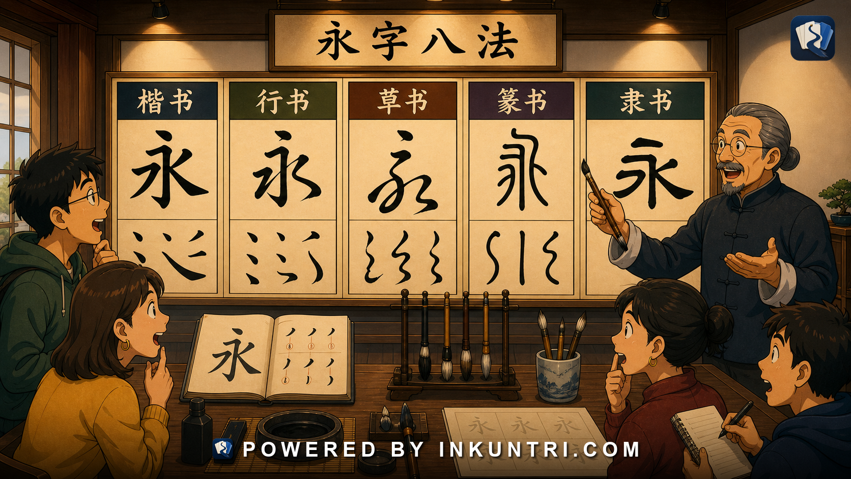
Core examples: 永字八法, 楷书, 行书, 草书, 篆书, 隶书, 王羲之 references, 春联, 牌匾, 书法落款. Recommended feature module: Script-style comparison panel: show the same character or phrase in printed form, regular script, running script, cursive-style handwriting, clerical script, and seal script, with labels for readability and likely modern context. Related internal articles: 006, 008, 010, 011, 023, 033.
Calligraphy is not a side hobby. It is a literacy layer.
Many Chinese learners treat calligraphy as an optional art activity: beautiful, old, intimidating, and not directly useful unless you plan to hold a brush. That is understandable. Most learners need to read signs, messages, menus, articles, and documents long before they need to write a hanging scroll.
But calligraphy still matters for ordinary literacy.
You meet calligraphic writing in shop signs, temple plaques, restaurant names, tea packaging, seals, New Year couplets, public monuments, museums, book covers, school mottos, cultural logos, wedding invitations, and handwritten notes. You also meet its influence indirectly whenever a font imitates brush movement, a logo borrows seal-script shapes, or an older person writes a character in a running-hand form that does not look like your textbook.
The goal is not to become a calligrapher. The goal is to stop being helpless when Chinese writing stops looking like a clean textbook font.
A useful learner stance is:
I do not need to produce calligraphy.
I do need to recognize the major styles, understand why forms vary, and know how to slow down when the writing gets artistic.
This article gives you that minimum durable literacy.
1. 书法 means more than “nice handwriting”
The word 书法 literally combines:
| Word | Pinyin | Basic meaning | Useful learner sense |
|---|---|---|---|
| 书 | shū | writing; books; to write | The written trace, not just the text content. |
| 法 | fǎ | method; law; way | Rules, technique, discipline, cultivated practice. |
So 书法 is not simply “pretty handwriting.” It is writing as a disciplined visual art. The shape of each character, the rhythm from one stroke to the next, the density of ink, the balance inside a square, and the movement across the page all matter.
For ordinary learners, this matters because Chinese characters are not only decoded as abstract symbols. They are also recognized through visual habits:
- stroke order
- component proportion
- balance between left and right parts
- spacing between characters
- the way strokes connect or separate
- the difference between printed and handwritten forms
- the amount of abbreviation a style permits
A person who has never studied calligraphy can still read printed Chinese well. But a person who knows nothing about calligraphic conventions may struggle with common visual forms that educated native readers recognize instantly.
That is the gap this article is trying to close.
2. The major script styles learners should recognize
Chinese calligraphy is often introduced through script names. These names can feel like art-history trivia, but they are practical labels. If you can identify the broad style, you can predict how readable it will be and where you are likely to see it.
The five style names most useful to learners are:
| Chinese | Pinyin | Common English name | What it looks like | Learner usefulness |
|---|---|---|---|---|
| 篆书 | zhuànshū | seal script | Rounded, symmetrical, ancient-looking, often uniform line thickness | Seen in seals, logos, cultural branding, inscriptions. Hard to read without practice. |
| 隶书 | lìshū | clerical script | Wide, flat, with distinctive flared strokes | Seen in plaques, art, formal/traditional design. More readable than seal script but still stylized. |
| 楷书 | kǎishū | regular script / standard script | Clear, separated strokes, close to textbook character structure | Best learner reference for handwriting and stroke order. |
| 行书 | xíngshū | running script / semi-cursive | Faster, more connected, more handwritten | Very important for reading real handwriting, signs, and informal calligraphy. |
| 草书 | cǎoshū | cursive script | Highly abbreviated, flowing, often visually compressed | Beautiful but often unreadable to learners and even difficult for many native readers without training. |
There are older categories such as 甲骨文 oracle-bone script and bronze inscriptions that matter for history and art, but the five above are the high-value learner set.
A simplified way to remember them:
篆书 = ancient/formal/seal-like
隶书 = broad/flat/clerical-looking
楷书 = clear/standard/learnable
行书 = running hand / educated handwriting
草书 = cursive / artistically abbreviated
Do not memorize these as a strict evolutionary ladder that every character passes through neatly. Real history is messier. But for reading modern Chinese environments, the labels work.
3. 楷书 is the learner’s home base
If you are learning to write characters by hand, 楷书 is the style you should think of as home base.
楷书 is regular script. It is what beginners usually see in handwriting models because strokes are visible and the structure is relatively clear. A properly written regular-script character lets you see:
- where the character begins
- how strokes are ordered
- which components are separate
- how much space each component occupies
- how vertical, horizontal, dot, hook, and turning strokes differ
Take 永 as a common practice character:
永The character is famous in calligraphy pedagogy because it contains several basic stroke types. You do not need to master the whole tradition of 永字八法 to benefit from the idea. For learners, 永 is a reminder that Chinese handwriting is built from recurring stroke actions, not from arbitrary lines.
A beginner who writes 永 as a random drawing may produce something recognizable. A learner who notices stroke direction, pressure logic, and proportion will build a stronger memory of characters in general.
楷书 is also the safest style for learning stroke order. Stroke order is not a ritual to make learners suffer. It has practical benefits:
- It makes handwritten characters easier to recognize.
- It helps handwriting input systems recognize what you write.
- It supports memory by making characters procedural, not just visual.
- It makes running-script variation easier to understand later.
- It reveals component structure that a copied drawing can hide.
You do not need perfect brush technique. You do need enough regular-script discipline that characters stop being pictures and start being structured movements.
4. 行书 is where textbook characters start acting like handwriting
Many learners learn printed characters and then feel betrayed by real handwriting. The betrayal often has a name: 行书.
行书, or running script, sits between regular script and full cursive. It is faster than 楷书, more connected, and often more relaxed. Strokes may merge. Dots may become short sweeps. Components may be compressed. But the character is usually still traceable if you know what you are looking for.
This style matters because educated handwriting often drifts toward 行书 even when the writer is not “doing calligraphy.” People rarely write every character in careful textbook form when taking notes, signing a card, labeling something by hand, or writing a quick notice.
Common changes in running-style writing include:
| Regular-script expectation | Running-hand tendency | Learner effect |
|---|---|---|
| Every stroke is separate | Adjacent strokes may connect | Components can look fused. |
| Dots are distinct | Dots may become small flicks or connected sweeps | 氵, 忄, 辶 may look unfamiliar. |
| Square structure is stable | Shape may lean or compress | The character may look more vertical or more slanted. |
| Stroke endings are clear | Endings may trail into the next stroke | You may miscount strokes. |
| Components are balanced | High-frequency components become shorthand | The most common words may be the most abbreviated. |
A practical example is 我. In a printed font, it is angular and separated. In handwriting, several strokes may curve or connect, and the final shape can look much more fluid. A learner who expects printed geometry may not recognize it quickly.
Another example is 这 / 這. The movement of 辶 in handwriting can be very different from the neat printed component. If you only know 辶 as a printed shape, handwritten forms can seem wrong. They are not wrong. They are written.
The solution is not to memorize every possible handwritten variant. The solution is to learn a few high-frequency transformations:
printed component → handwritten/running tendency
氵 → connected dots or flowing left-side shape
忄 → compressed vertical + dots
辶 → simplified sweeping base
口 → small square, sometimes open-looking
心 → compact, often less symmetrical
门/門 → faster enclosure shapes
After that, you read handwriting by components, context, and expectation, not by perfect stroke-by-stroke matching.
5. 草书 is not just “messy Chinese”
Learners sometimes look at cursive Chinese and say, “Native speakers must be able to read this instantly.” Not necessarily.
草书 is a highly abbreviated script tradition. It is not ordinary messy handwriting. It has its own conventions, histories, and specialist literacy. A skilled calligrapher’s cursive may be visually powerful while being difficult to read even for educated native readers who are not trained in that style.
That point matters because learners often blame themselves when they cannot read cursive calligraphy. You should not. Full cursive is not a normal first-stage reading target.
Use this hierarchy:
| Text type | Should a serious learner expect to read it? | Practical answer |
|---|---|---|
| Printed modern Chinese | Yes | Core literacy. |
| Clear regular handwriting | Yes, with practice | High priority. |
| Running-style handwriting | Gradually | Important, especially for signs and notes. |
| Clerical-style display text | Partly | Useful in cultural contexts. |
| Seal-script logos/seals | Only with strategies | Recognize style; decode slowly. |
| Full cursive calligraphy | Not reliably | Appreciate first; specialist reading later. |
The productive attitude toward 草书 is humility without defeat. You can learn to recognize that it is cursive, identify a few obvious characters, and use context. You do not need to pretend it is normal reading material.
6. 篆书 and 隶书 are style signals, not beginner scripts
篆书 and 隶书 often appear when something wants to signal antiquity, formality, culture, scholarship, or tradition.
You may see them in:
- museum titles
- temple plaques
- tea or wine packaging
- calligraphy exhibitions
- personal seals
- cultural institution logos
- book covers
- historical dramas
- old-style restaurant signs
- decorative inscriptions
篆书 can be especially hard because the character forms may be ancient or deliberately archaic. Even familiar characters can look unrelated to the modern printed version.
For example, a seal-script version of 中 may still be guessable. A seal-script version of 学 / 學, 国 / 國, or 书 / 書 may be much harder if the design is stylized.
隶书 is often more readable. It tends to be broad and flat, with distinctive sweeping strokes. Many learners can learn to recognize lishu-style display writing after some exposure, especially when the text is short and formulaic.
The main learner move is not to force these styles into modern handwriting categories. A clerical-style 春 on a New Year decoration may not look exactly like your textbook 春. A seal-script 印 on a logo may look like an ancient emblem. That is the point.
Ask:
Is this text trying to be read quickly, or is it trying to signal tradition?When the answer is “tradition,” slow down and use a different strategy.
7. Printed forms, handwritten forms, and calligraphic forms are not the same thing
A major learner mistake is believing that a character has one “real shape,” and every departure from that shape is sloppy or decorative.
Chinese characters have standards, but they also have styles. The same character can appear as:
- a modern printed form
- a textbook handwriting model
- a personal handwriting form
- a running-script calligraphic form
- a cursive form
- a seal-script or clerical-script display form
- a regional traditional/simplified/variant form
- a typeface-specific glyph
These layers overlap.
Take 门 / 門. A learner may know the simplified form 门. But in a traditional sign, you may see 門. In a brush-style logo, the enclosure may be stylized. In handwriting, the simplified form may be written more fluidly than the printed shape. In seal script, the shape may be much less obvious.
Or take 书 / 書. The simplified form 书 is already a modern standardized form. Traditional 書 preserves more visible structure. A brush-written 书 can look quite different from a font version because the internal movement matters more than printed geometry.
This is why serious learners should study characters as families of appearances, not single images.
A useful notebook format is:
Character: 福
Printed form: 福
Common context: blessings, New Year, signs, gifts
Handwriting notes: left 礻 can compress; right side may vary in style
Calligraphy contexts: often large single-character decoration
Warning: stylized 福 may be rotated, stretched, or artistically distorted
The goal is not to collect every possible version. The goal is to stop being surprised that versions exist.
8. Where learners actually meet calligraphy
You do not need to attend an art-history seminar to meet calligraphy. It shows up in ordinary public life.
春联: New Year couplets
春联 are couplets displayed around doors during the Lunar New Year period. They are often written or printed in calligraphic styles. The vocabulary may be auspicious, literary, and formulaic.
Common characters include:
春 福 喜 财 吉 祥 安 康 年 家 和A learner’s job is not to parse every classical phrase immediately. Start by recognizing the setting: red paper, vertical lines, paired structure, auspicious language, often read top-to-bottom on each strip.
牌匾: plaques and signboards
A 牌匾 may show a shop name, temple name, hall name, school motto, or institution. Plaque characters are often large, stylized, and sometimes written right-to-left in older contexts.
If a plaque has four large characters, do not assume you should read it like modern horizontal web text. Check:
- Is it vertical?
- Is it right-to-left?
- Is there a smaller inscription or date?
- Are there seals?
- Is the main text a name, motto, or poetic phrase?
书法落款: signatures, dates, and notes
A calligraphy work often has a main text plus 落款, the inscription/signature area. The 落款 may include:
- the writer’s name
- date or season
- occasion
- dedicatee
- place
- short note
- one or more seals
For learners, 落款 can be harder than the main text because it may be smaller, more cursive, and full of names or traditional dating terms.
A practical move: identify the main text first, then treat 落款 as metadata.
Logos and branding
A tea brand, bookstore, cultural foundation, museum, restaurant, or university-related design may use brush-style or seal-style characters. These are often designed to be felt before they are read. If a logo looks ancient or square-seal-like, it may be using visual association, not fast readability.
That is not a failure of your Chinese. It is a design choice.
9. A learner’s method for reading calligraphic text
When you meet calligraphic Chinese in the wild, use a process. Do not just stare at it harder.
Step 1: Identify the style range
Ask whether it is closest to:
regular → running → cursive
clerical → seal
printed brush-style font → actual handwriting
This tells you how much variation to expect.
Step 2: Identify the physical context
A temple plaque, restaurant sign, seal, calligraphy scroll, and handwritten delivery note obey different expectations.
Context predicts vocabulary. On a restaurant sign, you may expect a name ending in:
楼 馆 店 斋 居 府 堂 记On a New Year decoration, you may expect:
福 春 财 吉 祥 喜On a seal, you may expect a personal name, institution name, or formula such as:
印 章 之印 私印Step 3: Count likely characters
Calligraphic text is easier if you first count blocks. Is it one character? Two? Four? A vertical line of seven? A seal with four characters arranged in a square?
A four-character plaque is often a phrase or name. A four-character seal may be a name plus 印 or 之印. A vertical couplet may have matching line lengths.
Step 4: Look for anchor components
Do not try to identify the whole character at once. Look for components you know:
氵 木 口 心 言/讠 金/钅 日 月 人/亻 宀In stylized writing, components may stretch, merge, or compress, but some anchor shapes remain visible.
Step 5: Compare with regular script
If you can type a guess into a dictionary, image search, calligraphy dictionary, or OCR tool, compare the suspected character in regular script. The question is not “Does it match perfectly?” but “Can I see how one could become the other?”
Step 6: Accept uncertainty
Some calligraphic writing is deliberately difficult. A seal carved in archaic style or a cursive inscription by a master is not meant to be read like a subway sign.
Your goal is progressive recognition, not instant conquest.
10. What to practice, and what not to practice
Learners can waste a lot of time here. The practical path is selective.
High-value practice
- Learn stroke order for common characters.
- Practice writing high-frequency components clearly.
- Compare printed vs handwritten forms of common words.
- Learn the five main script names.
- Recognize 春联, 牌匾, 落款, 印章 as object types.
- Read clear regular-script handwriting.
- Build tolerance for running-style variation.
Lower-priority practice unless you love it
- Copying complex calligraphy scrolls.
- Learning full cursive conventions early.
- Memorizing seal-script forms for many characters.
- Studying art-historical lineages before you can read modern signs.
- Buying calligraphy tools as a substitute for reading practice.
There is nothing wrong with loving calligraphy. It can deepen your connection to Chinese writing. But as a language learner, do not let the romance of brush culture distract you from practical literacy.
A serious but sane plan:
First: read modern printed Chinese.
Then: learn standard handwriting and stroke order.
Then: recognize running-hand forms of common characters.
Then: learn where seal/clerical/cursive styles appear.
Then: pursue calligraphy as art if you want to.
11. Example walkthrough: reading a brush-style sign
Imagine you see a sign with three large brush-style characters:
老茶馆In a clean font, this is easy:
- 老 = old
- 茶 = tea
- 馆 = hall/shop/establishment
In a brush-style sign, 茶 may be stretched, 老 may have a sweeping lower part, and 馆 may have a compressed 饣 component. You may not recognize it immediately.
Use the method:
- Context: shop sign, likely a business name.
- Character count: three large characters.
- Anchor: 茶 often appears in tea contexts; 馆 often marks establishments.
- Likely reading: 老茶馆, “old tea house.”
- Confirmation: surrounding menu, teapots, or signage confirms tea-shop context.
You did not need art expertise. You needed context plus component awareness.
12. Example walkthrough: reading a New Year decoration
You see a single large character on red paper:
福The printed character has 礻 on the left and a right-side component. In a decorative calligraphic style, the left side may be stretched and the right side may be rounded or abstracted. The character may even be displayed upside down as a punning symbol of “fortune arriving” in some contexts.
A learner should note:
- A single red decorative character is likely auspicious.
- 福 is one of the most common candidates.
- Calligraphic distortion is expected.
- The object is cultural signage, not ordinary prose.
This is exactly the kind of literacy calligraphy awareness gives you.
13. Tool build: calligraphy literacy panel
A strong interactive module for this article would not try to teach brush mastery. It would teach recognition.
Core functions:
- Style slider: printed → 楷书 → 行书 → 草书 → 隶书 → 篆书.
- Same-character comparison: show characters such as 永, 福, 春, 中, 国/國, 文, 学/學, 书/書 across styles.
- Readability meter: label styles as beginner-readable, intermediate-readable, specialist, or primarily decorative.
- Context gallery: 春联, 牌匾, 印章, 书法落款, restaurant sign, museum label.
- Component anchor mode: highlight stable components across style changes.
- Stroke-order overlay: show how regular-script stroke order supports recognition of running forms.
- Guess mode: users identify a stylized character from multiple choices, then see why the correct answer works.
- Do-not-overread warning: mark examples where artistic design makes ordinary reading unreliable.
Sample interface text:
Character: 福
Context: New Year decoration
Printed form: 福
Regular script: clear 礻 + right-side structure
Running tendency: connected left-side strokes, compressed right side
Seal/clerical display: decorative; compare carefully
Learner note: recognize as an auspicious single-character decoration before analyzing every stroke.
14. What to remember
Calligraphy is not required as a performance skill. But calligraphy literacy is part of serious Chinese reading.
Remember these rules:
- 楷书 is your handwriting home base.
- 行书 explains much real handwriting.
- 草书 is specialist literacy, not a beginner failure.
- 篆书 and 隶书 often signal antiquity, formality, and cultural branding.
- Context matters as much as shape.
- Printed forms, handwritten forms, and calligraphic forms are related but not identical.
A learner does not need to become a calligrapher. But a learner who understands calligraphy as a literacy layer will read the Chinese visual world with far less confusion.
- Built from outline 022 in the Inkuntri Chinese article outline set.
- Main source anchors to check during final editorial review:
- Smithsonian National Museum of Asian Art, “China’s Calligraphic Arts,” especially the visual distinction among seal, clerical, running, and other script styles: https://asia-archive.si.edu/learn/chinas-calligraphic-arts/
- Smithsonian National Museum of Asian Art, “Writing, Carving, and Rubbing: China’s Calligraphic Arts,” especially the six-script overview and mention of tools, seals, and seal paste: https://asia-archive.si.edu/exhibition/writing-carving-and-rubbing-chinas-calligraphic-arts/
- Metropolitan Museum of Art, “Chinese Calligraphy,” especially the relationship between clerical, running, cursive, and standard scripts: https://www.metmuseum.org/essays/chinese-calligraphy
- Metropolitan Museum of Art, “Brush and Ink: The Chinese Art of Writing” press text, especially the summary of five basic script types and Wang Xizhi as a key art-historical reference: https://www.metmuseum.org/press-releases/chinese-art-of-writing-is-explored-in-new-metropolitan-museum-exhibition-2006-exhibitions
- Avoid presenting script history as a simple straight line. The learner version can be simplified, but final editorial review should preserve the distinction between historical development, calligraphic style, and modern display use.
Related reading
Building a Mandarin Reader Workflow From News, Documents, and Literature
The reader can build a sustainable Mandarin reading workflow that combines current news, practical documents, essays, and literature without drowning in vocabulary.
Memes, Homophones, and Political Caution in Chinese Online Culture
The reader can understand how Chinese online users use homophones, euphemisms, abbreviations, and layered jokes to manage sensitivity, moderation, and community recognition.
Chinese Characters Abroad: Hanzi, Kanji, Hanja, and the Shared Scriptworld
The reader understands the shared character tradition across China, Japan, and Korea while respecting each language’s independent grammar, pronunciation, and history.
Comparing Word Order: Chinese SVO vs Japanese and Korean SOV
The reader sees why shared vocabulary does not make sentence structure shared, especially when comparing Mandarin with Japanese and Korean.
Political Slogans and Four-Character Style Across East Asia
The reader understands how four-character rhythm and classical-style compression shape political and public language across Chinese, Japanese, and Korean contexts.
From Flashcards to Literacy: When Chinese Study Must Leave the Card
The reader can recognize when flashcards are helping and when they are delaying real Chinese literacy, then shift toward connected reading and listening.